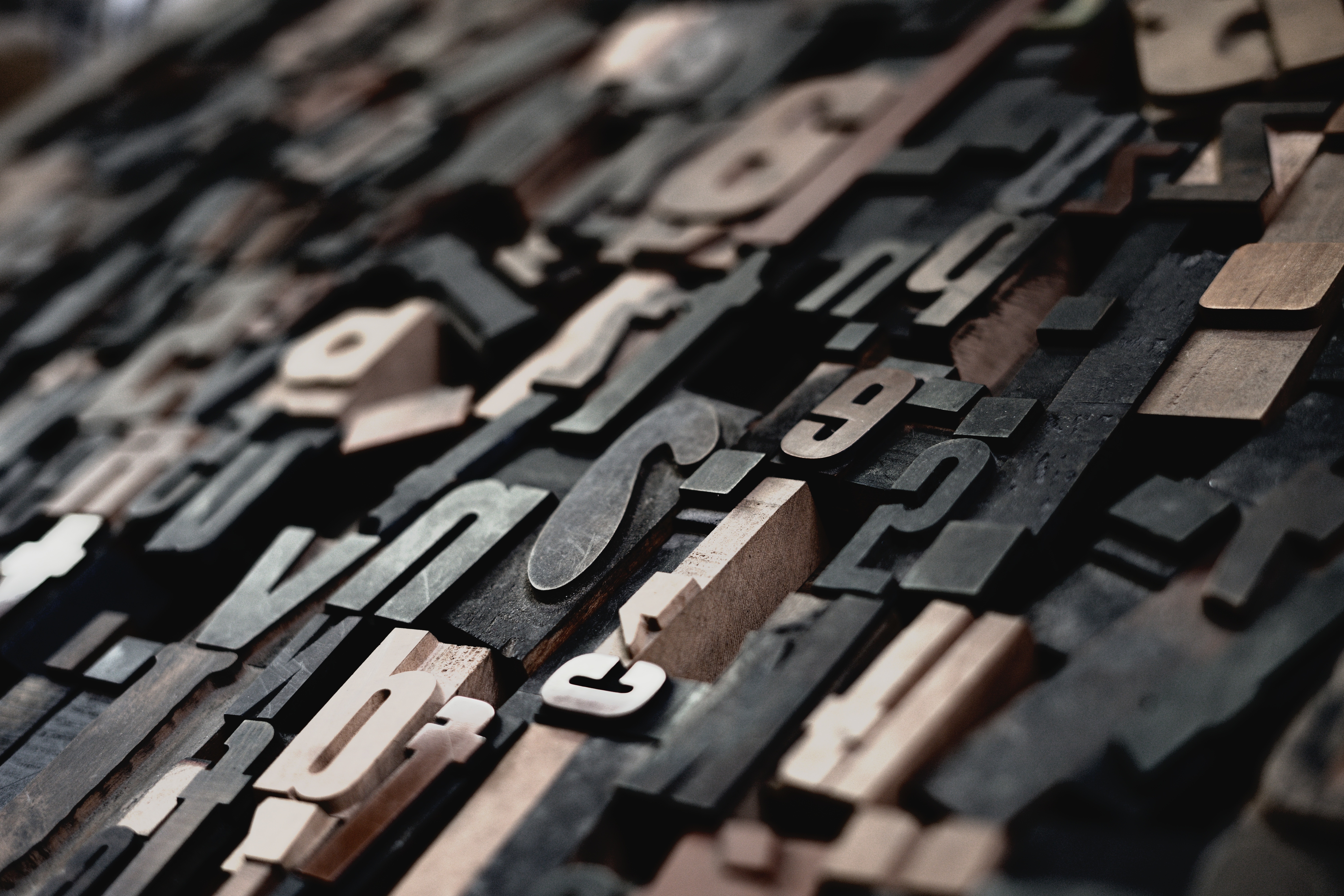
Kerning and Tracking and Leading, Oh My!
Many minor adjustments can be made to type. This is where kerning, tracking and leading come in. Kerning refers to the spacing between characters, not every letterform has the same measures of space around it when typed. Tracking is similar to kerning but refers to the uniform adjustment of spacing over a whole range of letters.
A font does not come pre-kerned. Sometimes characters will easily fall together when typed out and will have a visually pleasing amount of breathing space between them, but often we must use our eyes to decide to add or remove space between characters. It makes all the difference for the final product; you may not notice on a conscious level, but your brain has to do extra work when there is awkward space between letterforms.
Thinner Isn't Better
It is generally a bad idea to decrease the width of actual letters to make bodies of text fit in a given area, kerning and tracking are proper methods to achieving this. However, a small amount of change (from 1 to 5%) is sometimes acceptable if absolutely required.
Kerning and tracking can also be used in a creative way to purposely put extra space between letters to achieve a desired visual effect or create a certain energy.
Leading refers to the spacing between lines of type. More leading increases legibility and allows bodies of text to breathe, but will of course limit the amount of text that will fit on a page.
All of these fine-tuning aspects add a level of detail and professionalism to the art of displaying type to a reader, that will be met with willing or unwilling content.
Typography is about making language easy to read but it is also about communicating on an unconscious level of perception with the end-user and evoking emotions that will ultimately connect them in a visceral way with your product, service, or message.