Recently the City of St. Catharines and the design/branding/graphic community have been a bit at odds. The center of the debate: a new logo. Numbered are the days of the blue and green chevron - in it's place, another run of the mill municipality logo with lack lustre brand justification and an attempted message delivery that falls flat. My two cents: modernize the chevron. Just when this style of logo is making a resurgence we are turning our backs on something uniquely St. Catharines. Seems a shame.
The Chevron

The chevron logo dates back to 1972. For a community that is focused on preserving a historical identity whilemodernizing the core with new amenities, staying true to the brand we're attached to seems natural. The four blue lines which make up the letter 'S' represent the four Welland Canals. The green 'C' represents the agricultural roots and farmland. An accurate depiction of our corner of the world, no? I propose that the City of St. Catharines maintains the classic logo and hires in the savvy of a professional agency to modernize the logo to show our progression and respect for our roots.
The GO Train

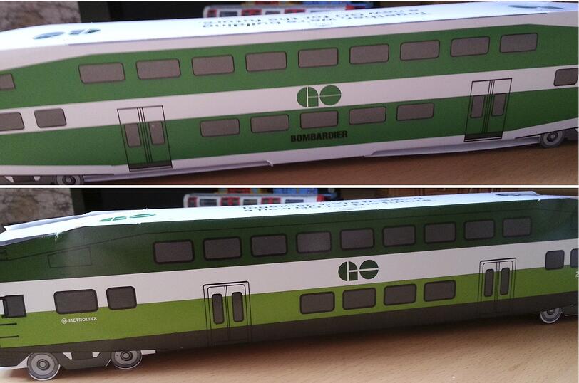
This particular methodology is top of mind because the GO Train is about to undergo a visual overhaul that puts to practice exactly the strategy I am talking about. The trains that perfectly matched the Ontario highway signs are about to be given a slick new paint job to be more modern and sleek as they cruise highway-side. The classic GO logo is undergoing very slight modifications that have a more modern aesthetic and cleaner overall appearance.
The Lesson
We could really take a lesson from the branding engineers at GO. The essence of a brand is the practice, the daily operations, the people, the history, the customer service: the brand is everything. But the logo makes a difference. A well crafted logo should be recognizable and why mess with a good thing. If you have outstanding identity recognition with your users/community/industry... tweak, don't overhaul. A good branding agency will tell you how to manipulate something that is already working. If it isn't working, hit the drawing board, by all means. But if you are identified by something that is uniquely representative of your business, embrace it and make it work hard for you!
Feel like your brand could use a bit of an overhaul? Looking at your website and thinking that there is some room for improvement? Connect with us.

